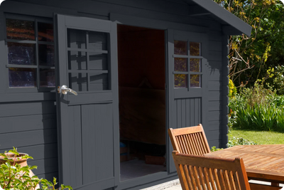
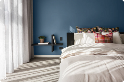
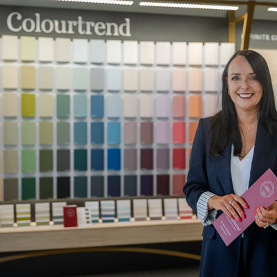
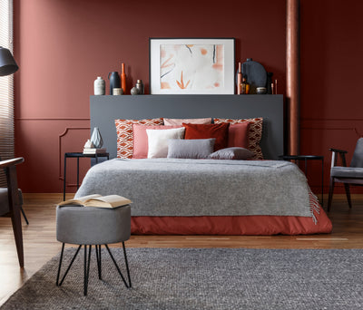
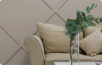
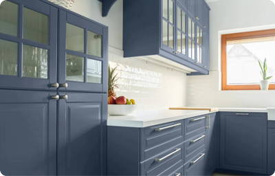
At Colourtrend, our network of colour experts are here to help you with all your colour queries. Our Online Colour Expert, Dervla Farrell, has a keen eye for colour that can help you approach your painting project with confidence. Read through Dervla's bio below to find out more about Dervla's love for all things colour and design. Dervla has also included her favourite colour scheme below, which includes the rich and alluring Profound, that can be seen in the feature image of this article.

Meet Dervla Farrell, Online Colour Expert
Before starting with Colourtrend as our Online Colour Expert, my love of colour played a prominent role in my life. After growing up being heavily involved in the arts, I went on to study Contemporary Visual Culture with the Technological University of Dublin (TUD), with an emphasis on curating and aesthetics. Whilst studying at TUD, I completed an internship as Assistant to the Curator with The Little Museum of Dublin, which involved the building and design of exhibitions.
Both design and colour have gone hand in hand throughout my previous professional experiences, which have ranged from luxury customer service, visual merchandising, colour consultancy and curating. I believe that the environments we surround ourselves in play a hugely important part in our happiness and vitality, which is why I am so passionate about colour and the role it can play in our surroundings and lives- whether it’s in the clothes we wear, the movies we watch or what shade we choose to paint our space.
Favourite Colour Scheme
What I love about this particular scheme is that each of these colours are versatile and beautiful as stand-alone shades. It’s Earnest’s drop of green that makes this shade so unique. Depending on the light, this hue can either appear as a light grey or a fresh shade of white. Schoolroom Green has a place in both a period home and a contemporary location, bringing a sense of tranquility and timelessness to any space. I love to offset a scheme like this with a warm tone like Tuscan Tile, the red brick hue of this shade makes this an amazing accent colour and a lively, sunny addition to this scheme. The final shade in this scheme is Profound, a deep, mature teal that makes a feature out of anything it touches.
These shades are all easily transferable from room to room and from wall to woodwork. I envision this scheme working particularly well in an open plan kitchen, with Tuscan Tile on the cabinets to bring warmth and excitement to the space and Schoolroom Green on the walls behind the cabinets to balance out the warmth and mark out the kitchen area. I would suggest that Earnest is used for the rest of the wall space to lift and make the best use of the open plan area. Then finally, Profound will make a beautiful feature as an accent colour, to perhaps upcycle some woodwork such as a dining table or kitchen dresser.
Book an Online Colour ConsultationDervla is our dedicated online colour consultant here at Colourtrend. To avail of Dervla's expertise and colour advice for your upcoming painting project, book an online colour consultation with Dervla here. If you would like to find out more about our online colour consultation service, you can reach out to us via our live webchat here online our via our social platforms @colourtrendpaints.
