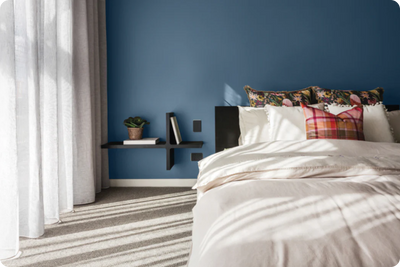
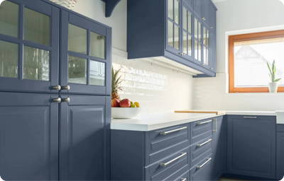
Introducing The Colour Edit Christmas Edition, brought to you by Colourtrend, colour expert Katie Walker.
This colour scheme is carefully curated by our colour experts, featuring a combination of rich, soft and electric shades that harmonise beautifully together to create a snug atmosphere.
Additionally, this colour scheme is carefully curated by our colour experts, featuring a symphony/combination of rich, soft and electric hues, specially chosen to complement and enhance one another. Consequently, the combination of this palette evokes a sense of snugness, enveloping you in an atmosphere that feels like a warm embrace, imagine sitting by the crackling fire, wrapped in a cosy blanket, savouring a cup of hot chocolate. Furthermore, this collection brings the nostalgia and warmth associated with this festive season, infusing your surroundings with a sense of familiarity and joy.
THE COLOUR PALETTE

Batch Loaf:

Batch Loaf, a soft taupe stands as a versatile warm neutral that forms the backbone of this colour scheme. Its understated elegance and neutrality make it an ideal backdrop colour to bring accent colours together. This versatile shade provides a calm, inviting atmosphere bringing a sense of balance and cohesion to any space. Consider using Batch Loaf as the primary wall colour in a room, allowing its soothing tones to set the stage for bolder accents or complimentary furnishings.
Baked Plum:

Baked Plum is a warm burgundy brown that emits richness and depth. Its earthy warmth perfectly complements Batch loafs neutral beige tones, creating a harmonious blend. Applying this shade as an accent adds a touch of sophistication and warmth, infusing spaces with a comforting and luxurious ambiance.
Chestnut Pink:

Chestnut Pink a contemporary blush pink infused with brown hues, introduces a modern twist to the classic pink palette.Moreover, this superbly versatile shade that finds it place in contemporary and traditional settings, adding a delicate, rosy warmth that softens and balances the overall palette.
Pink Chocolate:

Katie describes Pink Chocolate as a warm blend of pink and brown that brings a pop of cosiness and sophistication. This colour adds warmth and depth to this palette with a romantic touch of blush.
Turmeric:

Turmeric is a deep, warm gold that radiates vibrancy and is the perfect choice for a bold statement. Its spicy and energetic nature injects life into the palette, adding a pop of brightness. This colour adds a lively touch and a sense of adventure to this muted palette.
Nude Bisque:

Nude Bisque brings a cool taupe white with subtle biscuit tones to the palette. This gentle neutral adds a calming essence, contributing to the overall balance of the collection. When considering your design options, this about using Nude Bisque to introduce a clean and refreshing feel to the space. Additionally, it is particularly perfect for walls, trimmings or even furnishings against a deeper contrast such as Pink Chocolate.
Each colour in this palette brings in a unique essence, creating an inviting, snug and sophisticated palette. Furthermore, whether used individually or combined, these hues offer a diverse range of possibilities to create spaces that are both comforting and visually captivating.

INSPIRATION AND ADVICE
For more colour inspiration and advice, be sure to check out our blog, The Trend.
Follow us on all our social channels @colourtrendpaints. Our team is here to assist you from Monday to Friday via our live chat feature on our website. If you're looking for guidance on creating the perfect colour scheme for your home, explore our range of online colour consultation services.


