
It is getting warmer and the evenings are getting longer, Spring is upon us. Spring is a time for new beginnings and rejuvenation. What better way to revive your space than a fresh colour scheme that will invigorate your home.
The Colour Edit Volume 3, looks at how to incorporate refreshing new tones into your space from 3 amazing colour experts:
- Caroline Hurley, Co-Founder of Feather and Stone Studios and Interior Architect
- Dolores Farrell, Interior Designer & Colour Consultant at Brady’s of Greystones
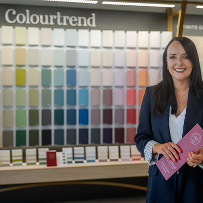
- Mary Kelly, Colourtrend Colour Consultant
THE SCHEME COLOURS
2023 is an exciting time for interior trends, with the emergence of new trends and a continuation of popular styles from previous years. Our colour experts have created a scheme that incorporates new trends, while ensuring that these colours will never go out of style.
The palette, specially curated for The Colour Edit Vol 3, emulates warm-toned revitalising colours that will work in just about any space around the home.
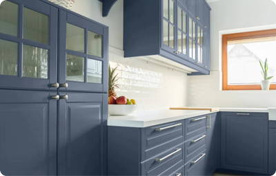
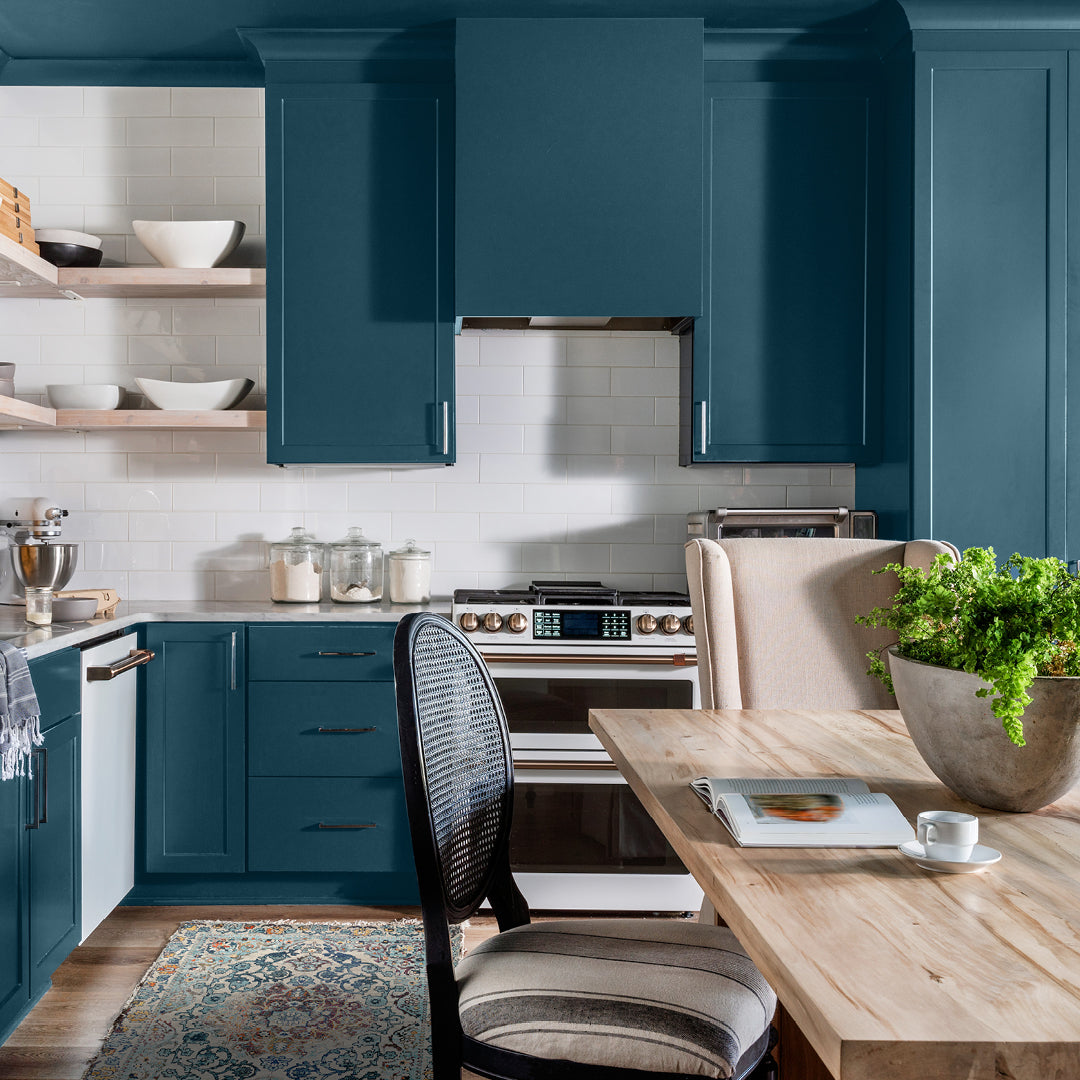
When asked about the scheme selection for The Colour Edit Volume 3, Caroline Hurley, Co-Founder of Feather and Stone Studios and Interior Architect explains that “this scheme, using Petrol as our hero colour and pairing it with the earthiness and warmth of Lowland, Mucky Swan and Newgrange means that you have a strong hero colour that could be used on built-in cabinetry, kitchen furniture or statement panelling.
You then have the option of using the gorgeous Spring-fresh Pantry Blue to complement the scheme woodwork, for example. Choose a combination of the warm tones from this palette - Mucky Swan, Newgrange or Lowland as the perfect warm, neutral wall colours.
Overall, this colour scheme is earthy and warm, while still being fresh and vibrant all year round."
 Colour; Petrol
HERO COLOUR
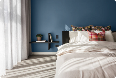
Our hero shade, Petrol, is a beautiful deep teal that adds depth and is complemented by the supporting colours, which will breathe new life into your home. We have seen a continued rise in homeowners gravitating towards teals, blues and greens, and Petrol ticks all of these boxes with it’s teal- green undertone. A versatile colour, that is an ideal choice for colour drenching or feature walls as well as an accent colour on kitchen cabinets and furniture.
COMPLEMENTARY COLOURS
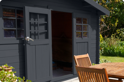
With the continuation of blues being on the rise, Pantry Blue is a lovely fresh tone, that works well with deeper and subtle tones. Pantry Blue is a stunning colour choice for nurseries, homes offices and woodwork, especially front doors.
Mucky Swan, one of our most popular neutrals, lends itself beautifully to both interior and exterior use. Mucky Swan will inject a fresh clean feel into your space, while still providing warmth.
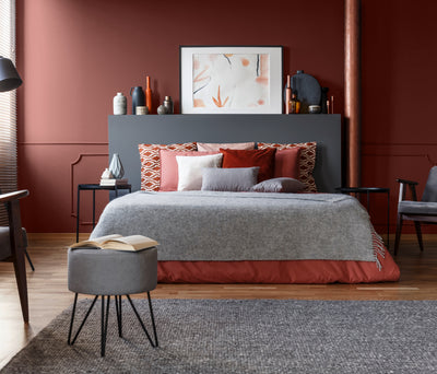
While pinks are on the rise this year, we understand that it can be a sometimes daunting colour to use. Newgrange has an elegant soft earthy pink tone, that will complement the natural light in any Irish home; especially bedrooms, living rooms and home offices.
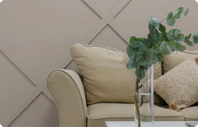
In keeping with the blush theme, Lowland is a fabulous subtle pink that unites the whole colour scheme. A tranquil tone, that is a great alternative to true neutrals and can be paired with deeper colours for balance. Lowland works well in living rooms, bedrooms and on woodwork.
 Colour; Lowland
HOW TO INCORPORATE THESE SHADES INTO YOUR SPACE
It can be difficult to choose between blues and greens, however, Petrol offers the perfect combination of both. It is a dynamic colour, that can be both energising and calming at the same time. Petrol is a popular choice for kitchen cabinets, paired with soft neutrals, ensuring your kitchen will be the envy of others.
Petrol is also a popular choice for panelling. Elevate your bedroom with Petrol as a feature wall, paired with a neutral like Mucky Swan, to create your very own sanctuary. Add in different textures, such as fabrics and flooring and you will never want to leave.
“Petrol is a great colour to add a pop to a room, it offers a rich depth of colour and again can be paired with many different tones and colours in both paint and accessories.” explains Mary Kelly, Colourtrend Colour Consultant
Pantry Blue is a universal colour, it can be used in so many different spaces. From bedrooms to home offices, Pantry Blue is a calming yet contemporary colour. A wonderful choice for adding some colour to a room as it pairs so well with both earthy neutrals and deeper tones.
Woodwork is also a great way to elevate your space with minimal work. Caroline Hurley suggests “using the gorgeous Spring-fresh Pantry Blue on doorways and architraves is a beautiful way to incorporate this colour and complement the whole scheme.”.
 Colour; Pantry Blue
With subtle hints of grey, white, and brown, Mucky Swan is the go-to neutral colour this season. Perfect as a trim colour or as an alternative neutral for walls. Consider colour drenching with this shade or as balancing out bolder hues like Petrol and Newgrange, among others.
Dolores Farrell, Interior Designer & Colour Consultant at Brady’s of Greystones explains why Mucky Swan is such a staple colour, “I find Mucky Swan such a versatile neutral. It works so well on both interior and exterior walls, kitchen cabinetry, ceilings and so much more.”.
 Colour; Mucky Swan
Newgrange is a great option to add a hint of colour into a room without overpowering a space, it's a more muted tone that can be paired so well with neutral tones. Ideal for living and dining rooms, Newgrange is a beautiful earthy-toned pink, that gives you a rush of colour and warmth.
Dolores Farrell explains why Newgrange is a must. “I absolutely love Newgrange! It is one of my go to colours. A fabulous brown, pink that works so well in many rooms. It is also a lovely addition to grey schemes for a quick update.”
 Colour: Lowland
Lowland radiates an undeniable sense of calmness and tranquillity. A beautiful alternative neutral tone, that will create an open atmosphere. Lowland works in harmony with soft earthy colours, like Newgrange and Mucky Swan, as well as deeper shades, like Petrol. An ideal colour option for a fresh feel in bedrooms, living rooms and bathrooms.
Lowland is a great colour to use as a base neutral in a room, it has a subtle brown undertone which gives a nice warmth. Lowland pairs so well with a variety of different colours, especially the darker tones.” describes Mary Kelly.
 Colour; Lowland
INSPIRATION AND ADVICE
Looking for more colour inspiration? Check out our blog, the Trend, and follow us on all our social channels @colourtrendpaints.
We are here to help online Mon-Fri via our live chat feature on our website, email at hello@colourtrend.ie and across all our social channels @colourtrendpaints. For advice on creating your perfect colour scheme for your home, explore our range of online colour consultation services here.