


Choosing paint colours for your home can feel like a daunting process. With so many options available, it’s easy to feel overwhelmed. But understanding a few key principles can make a world of difference. Whether you’re refreshing a single room or rethinking your whole home, advanced colour techniques can help you create a space that feels balanced, cohesive and uniquely yours.
Understanding the Colour Wheel: Your Decorating Compass
The colour wheel is the foundation of all great interior colour schemes. It shows how colours relate to one another and helps you create combinations that are either striking or soothing.
Complementary colours, such as blue and orange or red and green, sit opposite each other on the wheel and create strong contrast, ideal for bold feature walls. For something more subtle, analogous colours (like blue, blue-green and green) are close neighbours on the wheel and bring a sense of calm and continuity, perfect for bedrooms or peaceful lounges. Triadic schemes, such as purple, green and orange, can inject energy into spaces like kitchens or creative studios.
To keep your palette polished, follow the 60-30-10 rule: 60% dominant colour, 30% secondary, and 10% for accents.

Colour Matching for Flow and Consistency
Creating flow through colour is key in modern homes, especially open-plan layouts. Start with a base hue, maybe a warm neutral, a muted green or a soft chalky grey, and build your scheme around it.
Pay attention to undertones. Even whites and greys can have hints of pink, yellow or blue, which may clash or complement your chosen accents. And don’t forget that finishes matter, matt, satin and gloss all reflect light differently, which can affect how a colour appears.
Pro tip: Always test paint samples in natural and artificial light throughout the day.

@cathyflamingo Esker Ridge
Using Colour to Shape and Enhance Your Space
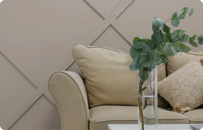
Colour isn’t just decorative, it’s architectural. The right palette can completely alter the perception of a room’s size, height and depth, making it one of the most powerful tools in interior design. If you’re working with smaller rooms, cooler, lighter tones like soft blues, dove greys, and creamy off-whites reflect more natural light and help open up the space. These colours visually ‘push back’ the walls, creating an airy, spacious feel that’s particularly effective in city flats or cottages with limited light.

@nestledbeneaththecomeraghs Temperance
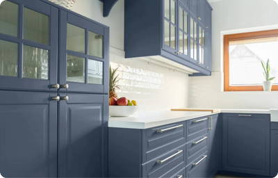
For large or open rooms that can feel stark or impersonal, introducing deeper, more saturated shades such as navy, forest green or moody charcoal brings warmth and definition. These hues create a cocooning effect, helping to draw in vast walls and make the space feel more inviting and lived-in. Don’t be afraid to layer these with textured finishes like velvet cushions, dark wood furniture, or brushed metals for added luxury.
Design tricks using colour can also influence a room’s shape. To elongate a narrow space, paint the end walls in a darker tone than the side walls, this creates visual depth and draws the eye through the room. Similarly, to make a high ceiling feel cosier and more intimate, consider using a shade on the ceiling that’s a touch darker than the walls. This subtle shift ‘brings the ceiling down’ slightly, perfect for balancing tall rooms that might otherwise feel echo-ey or vast. For a modern, cohesive twist, you might even extend the wall colour onto the ceiling for a wrapped effect, especially striking in deep jewel tones.

@nikdillonhome Sweet Caper
Solving Tricky Spaces: Hallways, Bathrooms and Open Plans
Some areas of the home pose unique challenges, but with thoughtful colour choices, even the most awkward spaces can shine. Take hallways, for instance. Often narrow and short on natural light, they’re easily overlooked in a decorating plan. However, these transitional spaces can become beautiful features in their own right. Using a soft, neutral base, like a warm greige or a muted clay, helps to keep things bright and open, while rich accents on internal doors or skirting boards can introduce character without overwhelming the space. Hallways are also a fantastic opportunity to showcase art or family photos, which can be unified with matching frames or a consistent backdrop colour.

@kiely.studio Arctic Blonde, Milk Teeth & Black
Bathrooms, particularly those without windows, require a little more thought when it comes to colour. Whites that are too stark can feel cold under artificial lighting, so instead look for warmer whites, blush tones, or soft coastal-inspired pastels. These colours help balance the harsher glow of overhead fittings, creating a more serene and spa-like atmosphere. Pair with tactile materials, like natural stone, brushed brass fixtures, or soft cotton towels, for a layered and luxurious finish.
Open-plan living, dining and kitchen areas are increasingly popular, but without thoughtful colour zoning, they can feel disjointed or chaotic. The key is to define zones visually while maintaining a cohesive thread. For example, a gentle taupe in the dining area provides a grounded, sophisticated tone, while a subtle sage green or dusty rose in the lounge offers softness and calm. These transitions don’t need to be bold, sometimes, even a slight shift in shade is enough to give each space its own identity. Incorporating natural materials like oak flooring, linen upholstery or woven light fittings can further unify the space, adding texture and cohesion while highlighting each area’s purpose.

@cedarbrookdesign Chestnut Pink
Final Thoughts: Making Colour Work for You
Understanding colour matching and applying advanced colour techniques doesn’t require a design degree, it just takes a little knowledge and the willingness to experiment. From the colour wheel to illusions of space, you now have the tools to create a space that feels beautifully you.
Still unsure? Our expert team is always happy to offer personalised advice. Because when it comes to decorating, the right colour isn’t just a paint swatch, it’s a feeling.